A checkout page refers to any website pages shown to a customer during the step-by-step checkout process. Think of a checkout pages as the online version of a physical checkout counter in a grocery store. Checkout pages come in two types: one-page checkout and multi-page checkout.
One-page Checkout vs. Multi-page Checkout
As the terms imply, checkout pages can be built as single-page solutions or as step-by-step processes. Although the one-page checkout option is rapidly gaining popularity among online retailers due to its perceived benefits of being faster and more user-friendly, various case studies demonstrate that conversion-optimized multi-page checkouts can be just as effective, and both options have their pros and cons.
One-page Checkout: Pros
It’s faster. Despite the fact that the number of form fields to fill are pretty much the same between single-page and multi-page checkouts, it still takes less time to complete the one-page checkout because shoppers don’t need to wait for the multiple pages to load or refresh.
It has a psychological advantage. The fact that shoppers can see exactly how far along the process they are, and how many steps they have left to complete the purchase, acts like a psychological booster motivating them to finish what they’ve started.
It has no navigation. Since all the fields are on the same page, customers don’t need to navigate between different pages if they want to edit or change the information they entered. It eliminates the possibility of shoppers dropping off if they need to re-enter the same details every time they go back in the browser.
One-page Checkout: Cons
It’s a nightmare to design. Depending on the amount of data you’re trying to gather, one-page checkouts can be difficult to design. When crammed into one page, the number of forms and fields required can cause the layout design to look cluttered and off-putting, which would most likely lead to shopping cart abandonment.
Multi-page Checkout: Pros
It’s easier to collect data. By splitting your checkout process into multiple steps, you have a better chance of capturing customer data even if they abandon the cart at a later stage. For example, if you ask for the shopper’s email address first and they end up abandoning the checkout after proceeding to the next step, you still have their email address and can follow up with an abandoned cart email.
It’s simpler to design. When you spread the forms across several pages, it is much easier to create a clean, minimalistic layout design, which also gives the impression of the checkout process being simple and fast.
Multi-page Checkout: Cons
It can be disheartening. If the checkout progress bar is showing four more steps to go until the order is complete after the initial page, a customer might find the process too long and tedious and abandon the purchase altogether.
Choosing between the two options will ultimately boil down to the type of business you’re running and your customer base. The important thing to remember is that selecting the type of checkout page is just the first step, next, you should look at ways to optimize it.
Tips to Optimize an Online Checkout Page
Before you start changing anything on your checkout page, ensure you have a crisp understanding of all the problems that need to be addressed. Going at this blindly might do more harm than good. Make use of Google Analytics, heatmaps, and A/B testing to determine friction and drop off points and implement relevant changes to improve the conversion rate. A few reliable tactics you can try are:
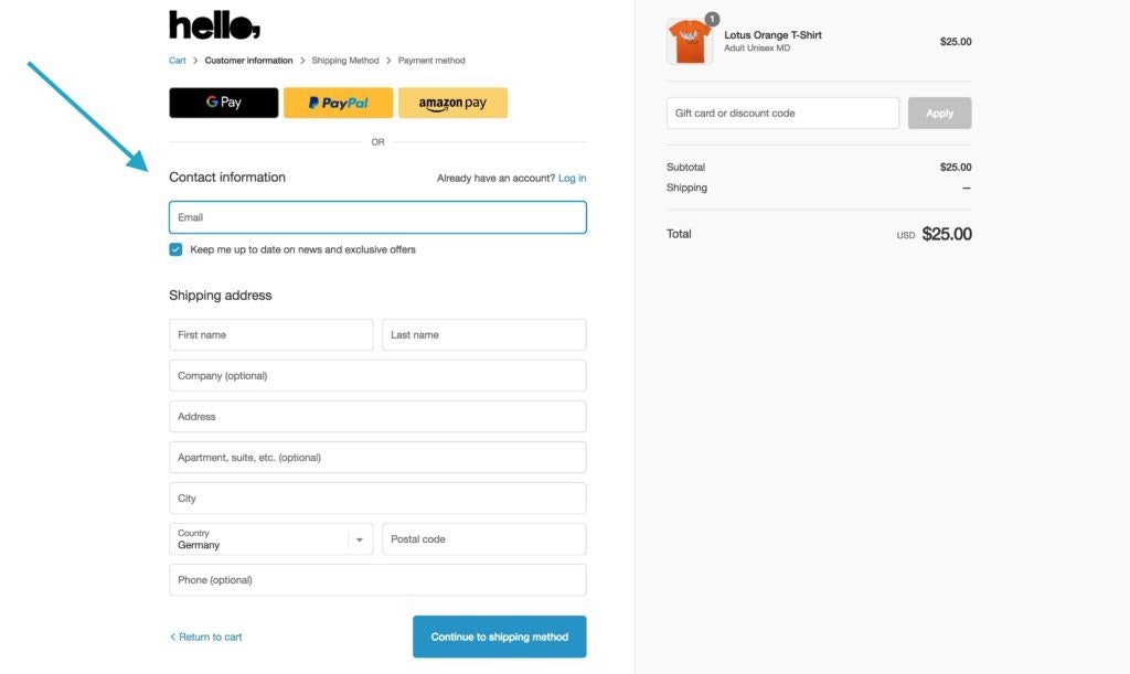
Skip the mandatory registration: more and more users expect to have the guest checkout option when they proceed to the payment page. You can also offer the option to log in via social networks or Gmail or ask them to register on the thank you page if you’re trying to collect more data, but be sure to remove the registration barrier in order to increase conversions.
Offer multiple payment options: it’s a good idea to display payment options as early as the product page to avoid causing frustration later in the process. The wider the choice of different payment gateways, the more chances are your customers will complete their journey.
Help buyers feel more secure: minimizing the risks involved in online shopping will help your customers follow through with their purchase. You can do that by adding security seals and payment logos as well as offering a money-back guarantee or free refunds option.
Add ‘save the cart’ option: allowing your buyers to quickly and easily resume their shopping by providing the option to save the entire cart or individual product for later will increase the odds of them returning to complete the order.
Offer free or cheap shipping: with the Amazon Prime on the rise, buyers are starting to take free shipping for granted. High shipping charges is one of the main cart abandonment reasons, so it’s best to be transparent about them upfront or, when possible, remove the additional fees entirely.