So you’re generating traffic, but you’re not getting any sales.
Would you believe us if we told you that this is actually a blessing rather than a curse?
Not convinced? Let’s take a step back for a moment.
Sure, on the one hand you’re not making any sales, but let’s look at the positives here.
Something is obviously going right. People actually care enough about your brand or your marketing to visit your website.
That’s huge. But we still need to start turning some of that traffic into sales.
Thankfully this issue is a fairly common one for ecommerce businesses, and it’s one which we’re sure you can solve.
That’s exactly why we’ve created this article – we’re going to cover the five things that you need to consider when you’re getting traffic but no sales.
We’ll explain everything you need to know to start moving forward with your business and begin converting your traffic today.
Okay, let’s dive into it.


1. Where Do You Land Your Customers?
Let’s kick things off with a fairly simple question: Where do you land your customers?
If you’re generating traffic, that’s no coincidence.
→ Click Here to Launch Your Online Business with Shopify
You’ve succeeded with your Facebook ad, your social media post, or whichever tactic you used to get potential customers onto your website.
But it could be the actual page that you’re landing your customers on which is hampering your chances to convert them into a paying customer.
Our best advice is to land customers on a page which delivers on the value which was promised to them by your marketing campaign.
Let’s take a closer look at what I mean with this example from Zalando:
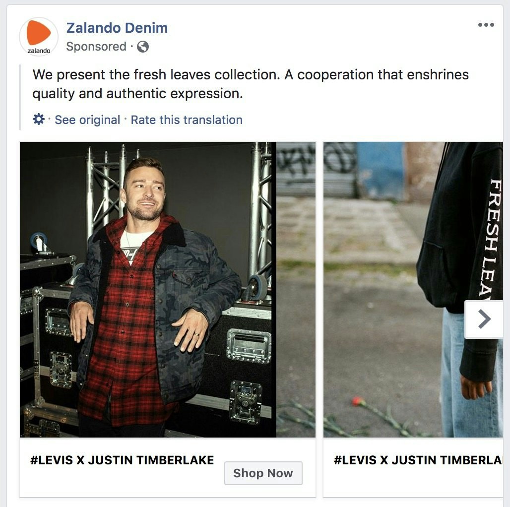
This carousel ad popped up on my Facebook feed earlier this week.
I like denim, and I like Justin Timberlake (and I’m not afraid to say it), so of course I clicked on the “Shop Now” button.
The Facebook ad directed me to a curated collection page which highlighted numerous products from the Levis x Justin Timberlake collaboration.
No specific products were highlighted in the ad, so I was happy to land on a collection page which I could browse through at my leisure.
This ad totally delivered on the value that was promised to me.
On the other hand, if Zalando had landed me on their homepage, for example, I’d have been slightly confused, and would probably have just clicked off the tab altogether.
And that’s why it’s always important to consider where you’re landing your potential customers.
You don’t want to waste time, effort, and money marketing your products and landing them on a page which doesn’t match up with their expectations.
If you are landing your customers on a page which doesn’t fit your marketing campaigns, consider directing them to a different page – this could be the reason why you’re generating traffic, but not getting any sales.
2. Is Your Website Easy to Navigate?
For entrepreneurs who run a brick and mortar store it’s fairly simple to provide a personalized shopping experience for potential customers.
They can walk shoppers around their store, ask questions to help customers find what they’re looking for, offer positive feedback, and provide a tailored service to any shoppers who enter their store.
For ecommerce entrepreneurs, it’s a little harder to provide a similar service.
You can still provide a fantastic shopping experience for your customers, you just need to approach it from different angles.
And one of the best things that you can do is make sure that your store’s design is clear, and that it’s easy to navigate without any hand holding from your side.
If you’re getting traffic but no sales, your store’s navigation could be one of the reasons why your visitors aren’t converting.
Think of it like this – you’re directing a targeted audience of shoppers to a store which they probably haven’t visited before.
You need to come across as a professional, legitimate business.
Why? Simply put, trust is everything when it comes to online shopping.
And there’s nothing which will drain your trust battery faster than a website which is difficult to navigate.
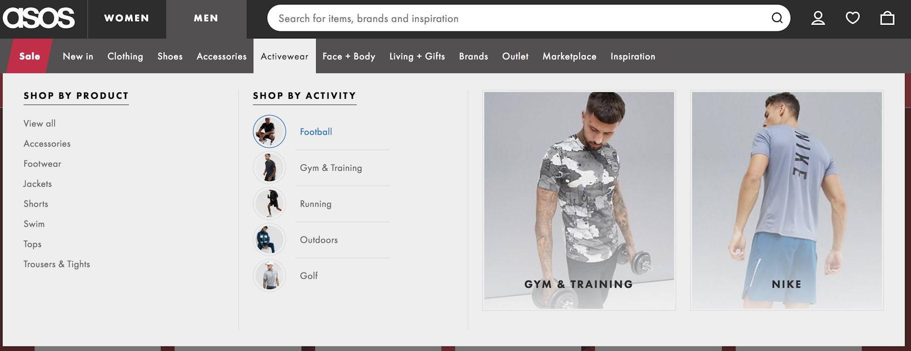
Here’s a great example of a website which is super easy to navigate:
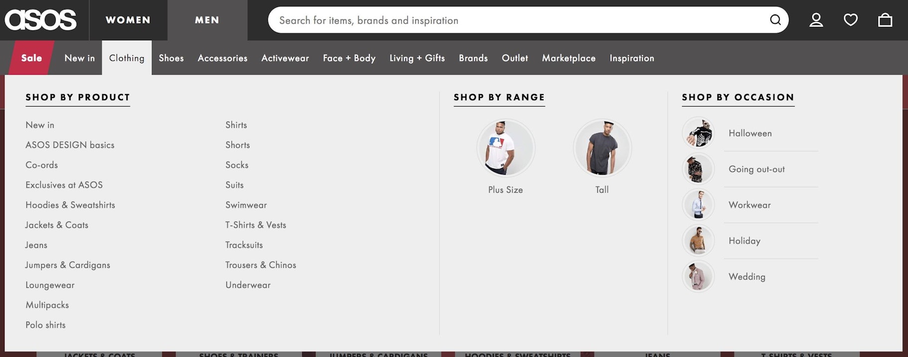
ASOS uses plenty of categories and subcategories to clearly define the types of products which they’re selling.
It’s clear that they’ve done a lot of research into who their target audience is, as they’ve also added in a “Shop By Activity” section to their dropdown menu, which really helps shoppers to hone in on the products that they’re looking for.
But clear navigation doesn’t just help to provide a fantastic user experience for your potential customers.
It can also help you to increase your average order value.
Think about it – customers who find it easy to locate products that they’re interested in are much more inclined to continue searching, even if they’ve already found what they’re looking for.
Heck, I end up buying extra products when I’m shopping online on a regular basis (I’m sorry bank balance, honestly).
So, try to make sure that navigating your store is a breeze.
A good starting point here is to ask a friend or family member to try and find a specific product on your store, and just watch what they do.
If they find the product first time, you’re all good, but if they struggle consider making some changes.
3. Are Your Product Pages Optimized?
I always like to think of product pages like book covers. Honestly, there are so many parallels.
A great book cover has an enticing image, a clear title which helps you to understand what the book is about, and a synopsis on the back with more information.
All of the above can be said of product pages too – you need appealing images, clear product titles, accurate product descriptions, and information about the sizes or colors which are available on your product page.
The difficult part in optimizing your product pages is finding the right balance – you can’t add too much information because it’ll make the page look cluttered, but you also can’t add too little because then you might leave your pages looking bare.
We know it can be tough to come up with great product pages, so here’s a quick breakdown of our top tips:
- Images: Try to include at least 4 high quality images on every product page.
- Title: Be clear, concise, and consistent with your product titles.
- Description: Speak to your audience. Match your descriptions with your brand voice. Remember, sometimes less is more.
- Reviews: Social proof is powerful. Leverage reviews from previous customers to help you to convert new ones.
- Stock meter: Consider showing the number of products left in stock. If a product is limited, this could create urgency which will help you to convert customers.
- Call-to-action (CTA): Include one clear CTA to coax shoppers into converting.
Remember, there isn’t a one-size-fits-all approach to product pages, it’s all about what fits your audience best.
Some companies, like Bodybuilding.com, create comprehensive product pages with a ton of information, like this snippet below shows:
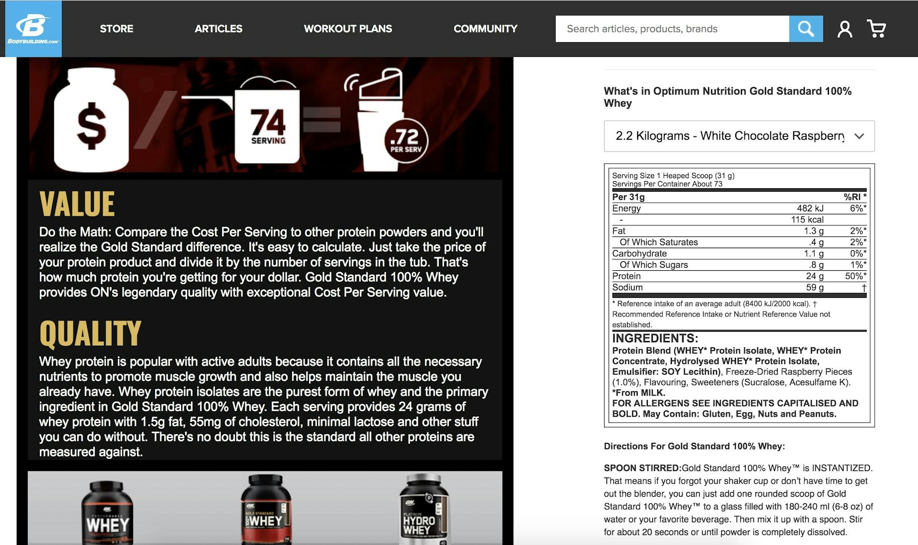
This is a wall of text, but if you’re purchasing fitness supplements then you’re likely to be interested in this information.
Other companies, like Palace Skateboards, use minimal text on their product pages:
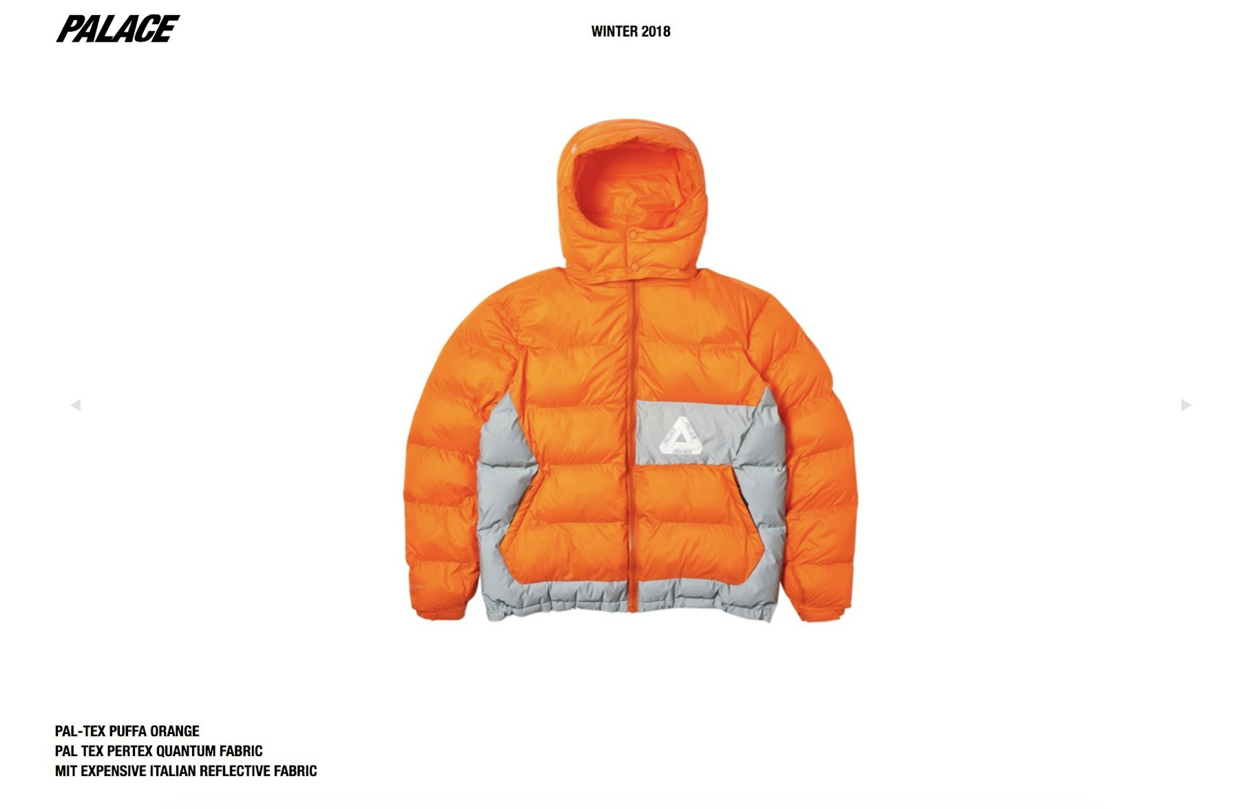
Palace succeeds by using minimal text, and just letting their high-quality product photos speak for themselves.
Both of these brands are successful because they’ve built up their own style, which fits the needs of their customers, and that’s something you should aim for too.
Test different variations of your products pages out and see which one works best for your audience.
You can also read our guide to creating compelling product descriptions here.
4. Is Your Checkout Process Optimized?
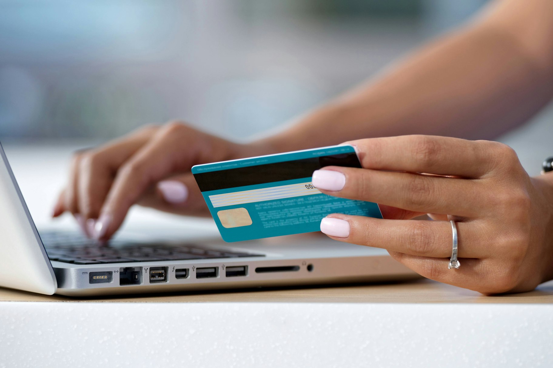
Whenever a shopper gets to your checkout page, they’re a few clicks away from making a sale.
Let that sink in.
All the hard work you put into building your store and coming up with marketing campaigns is so close to paying off.
But then the shopper doesn’t buy the product. Instead, they just leave your website.
So close, yet so far.
Now, there are quite a few reasons why this might have happened.
But one thing to consider is that it might have been your checkout process which caused them to leave.
So be critical with your checkout process.
Does it look trustworthy? Does the designs match up with the rest of your website and match up with what you’d expect from a professional business?
Is your checkout process streamlined? Do you request every customer to sign up for an account before they make a purchase? If you do, is that really necessary?
But most importantly, would you like to go through your checkout process?
Go through the whole flow and check if there are any obvious improvements which could be made.
Start from your homepage, find a product, add it to your cart, head over to the checkout, and place a test order.
Was it easy to do? More importantly, could it be easier?
As a general rule, the best checkout processes require as little information, time, and effort from your customers as possible.
Remember – finding products is fun, but paying for them isn’t.
Make it as simple as possible for your customers to get what they want – and in turn, you’ll have a much better chance to convert them.
5. Are Your Policies Clear?
Earlier in this article we mentioned trust, and how important it is in the relationship between an ecommerce business and shoppers.
One of the tactics that you can use to build trust, and help to start converting your traffic into sales is transparency.
Be clear, open, and honest with your customers.
Make sure that vital pieces of information, like your returns policy or shipping times, are easily accessible for your potential customers.
Why?
Simply put, they need to be able to access this information – it’s vital information for some shoppers when they’re thinking about making a sale.
Plus, you’ve got nothing to hide, so don’t feel the need to.
If you’re looking for an example of transparency done right, Burt’s Bees is a fantastic one.

On their webpage banner they’ve got very prominent pages detailing the ingredients that they use, and information about the brand and the values which they value.
Clear and simple to find. Perfect.
But what about their privacy policy? How do I know if they’re going to keep my private information private after I’ve made an order?
Okay, let’s scroll down to the bottom of the page, that’s usually where companies place this information.
Here’s what we see:

Perfect again. I see the privacy policy, the terms and conditions page, and even more information about the skincare philosophy.
Bonus points for the social media buttons too – I can check out their social channels and check out their content for even more validation if I needed it.
These might looks like subtle additions, but all of these are calculated, and can help you to convert traffic into sales.
But what about your store? Are you transparent with your policies?
If you aren’t, now is the time to change – it could be the blocker that’s stopping your traffic from converting into sales.
Start Utilizing These Tactics
Okay, there you have it – those are our top five things to consider when you’re getting traffic but no sales.
Take your learnings from this post and implement them for your store as soon as possible – any one of these tips could be the problem solver for your business.
If you’ve got any questions about conversion optimization, setting up your store, or ecommerce in general, leave them in the comments section below – we read them all.
We’ve also left some additional resources below to help you on your entrepreneurial journey.
